A Glimpse into the Timeline: a Probabilistic Event Log for Snabb
Max Rottenkolber <max@mr.gy>
Wednesday, 2 January 2019

I have recently spent some time integrating Luke Gorrie’s timeline into Vita. The timeline is a probabilistic, low overhead event log for Snabb. It inhabits a space somewhere between a sampling profiler and a circular log, and acts like a flight recorder for high-resolution events that are sometimes mere hundreds of cycles apart.
Like a sampling profiler, it only samples a subset of the total set of actual events (logging all events would produce way too much data, and result in prohibitive overhead), but, like a traditional log, it preserves the context and semantics between consecutive events.
How it works
The timeline is implemented in a way that is domain specific to Snabb. Before each breath of the engine, a rate threshold is selected at random that governs which events are logged. In my current branch of the timeline each event has a level and a rate, in addition to a set of arguments that are logged with the event. Level and rate are integers from 0‑9, bounds included.
1,5|breath_start: breath totalpackets totalbytes totaletherbits
 The engine starts an iteration of the packet-processing event loop (a
 "breath".)

2,4|breath_pulled:
 The engine has "pulled" new packets into the event loop for processing.

2,4|breath_pushed:
 The engine has "pushed" packets one step through the processing network.

1,5|breath_end: breath npackets bpp
 The engine completes an iteration of the event loop (a "breath.")
<level>,<rate>|<event_name>: [<args>...]The level of an event denotes its place in the hierarchy of events. In the example from above, breath_pulled and breath_pushed are events that happen in the context of a breath which is enclosed by the events breath_started and breath_end.
breath_started
  breath_pulled
  breath_pushed
breath_end
With each event we log the state of the CPU cycle counter, and define the “lag” of an event to be the delta between the cycle count of the event itself and the cycle count of the closest previous event with equal or lower level. For example, the lag of the breath_pushed event indicates how many CPU cycles took place since the breath_pulled event (i.e, the latency of the breath’s push phase), and the lag of the breath_end event indicates the latency of the whole breath.
The rate of an event decides whether it will be logged in a given breath: an event will only be logged if its rate is greater than or equal to the current rate threshold. Keeping with the example above, for breaths with a threshold of six we would log none of the specified events, for breaths with a threshold of five we would only log the breath_started and breath_end events, and for breaths with a threshold of one we would log all events.
The threshold dice are rolled in a way so that events with a lower rate are less likely to be logged in a given breath than events with a higher rate. Some events (rate=9) are always logged unconditionally, and some events (rate=0) are never logged.
function randomize_log_rate ()
   -- Randomize the log rate. Enable each rate in 5x more breaths
   -- than the rate below by randomly picking from log5() distribution.
   -- Goal is ballpark 1000 messages per second (~15min for 1M entries.)
   --
   -- Could be better to reduce the log rate over time to "stretch"
   -- logs for long running processes? Improvements possible :-).
   --
   -- We use rates 0-9 where 9 means "log always", and 0 means "log never."
   local rate = math.max(1, math.ceil(math.log(math.random(5^9))/math.log(5)))
   timeline_mod.rate(timeline_log, rate)
end
As a convention, I decided to reserve event levels 0‑4 for use by the engine, and allow levels 5‑9 to be used by user defined, application specific events. A remaining rough edge is that one needs to be careful with mixing event levels and rates, as not to create non-deterministic event lag semantics.
RIGHT                  WRONG
5,3|op_start:          5,2|op_start:
  6,2|op_iter:           6,3|op_iter:
5,3|op_end:            5,2|op_end:
op_inter event’s lag depends on the log rate at the time of sampling.Finally, the events are logged to a space-efficient, circular, binary log file where new events will replace old events as they come in. Logging a single event takes about 60 cycles (something to keep in mind when looking at latencies). The log file is memory mapped from a tmpfs to ensure quick access, and can be copied to stable storage at any time to persist a snapshot.
Analyzing the event log with R
To get insight out of the collected data there is an R program, timeliner.R, that can parse the binary event log. Once the events are imported into an R workspace, there are virtually infinite ways to whack the data, of which I am only beginning to scratch the surface of. While it is possible to come up with specialized, ad-hoc visualizations for your data at hand, timeliner.R comes with a few predefined plots that are generally applicable, a selection of which is showcased below (excuse the tiny labels, you might have to “View Image” to enlarge.)

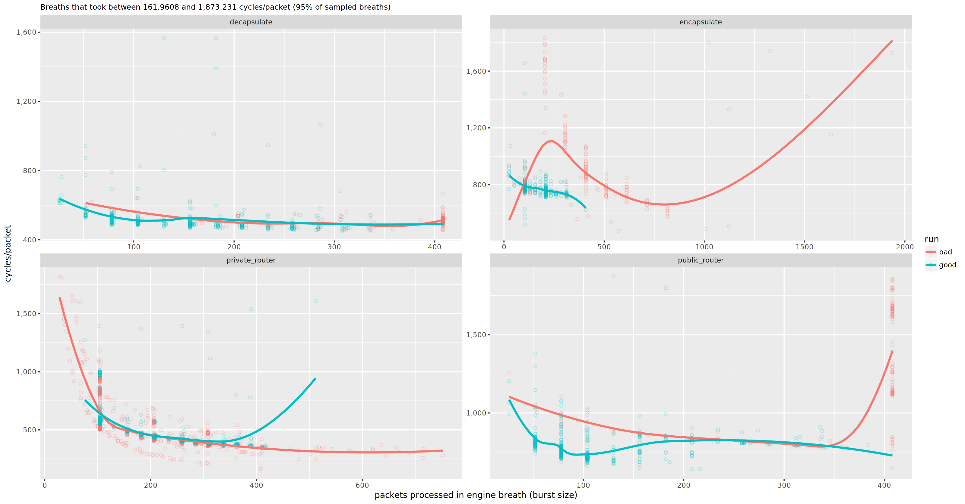
The “breath efficiency” plot above contrasts the relative performance metric of CPU cycles per packet on the X-axis with the engine burst size on the Y-axis, faceted for a set of processes. Each dot represents a breath_end event, and the lines are models fitted by R.
This particular plot compares two different benchmark runs, “good” and “bad”, where I wanted to figure out why one was faster than the other. What can we take away from this plot?
- the
decapsulateprocess seems to behave more or less equivalent in both runs - in the bad run, the
private_routerprocess appears to be often starved of packets to process in a breath (I happen to know that it would process ~100 or more packets every breath if it could) - the
encapsulateprocess appears less efficient in the bad run, but it also processes larger burst sizes (is it swamped in work?) - the
public_routerprocess in the bad run looks like it can not keep up with the throughput, and takes more cycles per packet
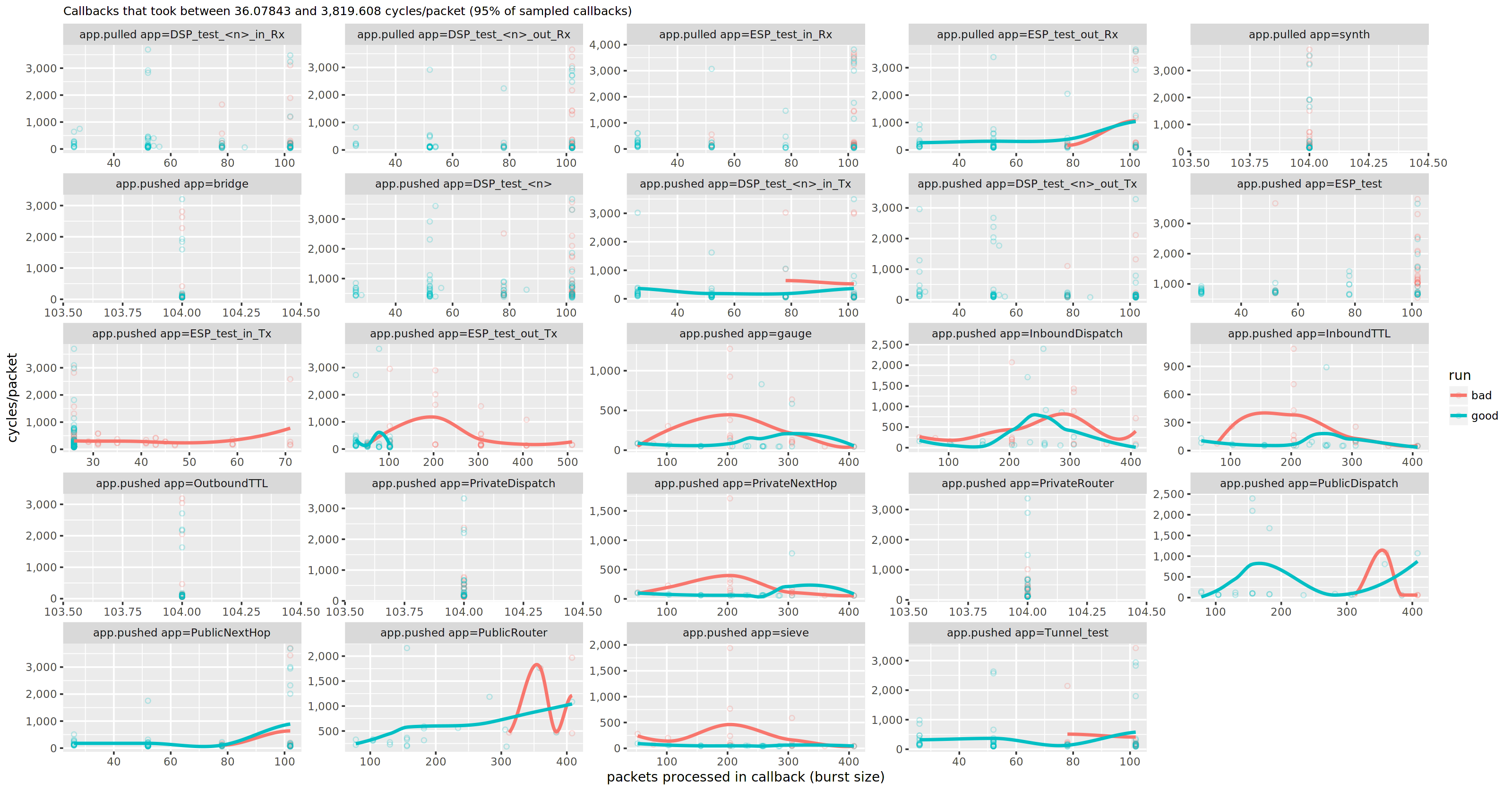
I bet the issue lies in either of the latter two processes. We can zoom in and look at the efficiency of the individual callbacks in a plot much like the above, only subdivided by app callback instead of by process.

Woah! There is a lot going on here. Alrady knowing the solution, I can fast forward past the minutes squinting at these plots, questioning the fitted models and doubting the quality of my samples, and focus on how the PublicRouter app is pushing (last row, second column). Zooming in even further, we can look at some application-defined, low-level events, that should correlate with the hunch in latency of the app.pushed app=PublicRouter event in the plot above.

These particular events (public_route4_start and public_route4_end) mark the start and end latencies of looking up the security association (SA) for a single packet. And sure enough, the bad run takes twice the amount of cycles to perform that lookup.
There is a lot more to look at in data contained in this particular set of timeline logs, and surely a lot be learned from, but these few examples might provide an idea of why the timeline is useful.
Comparing the VMProfile with Studio
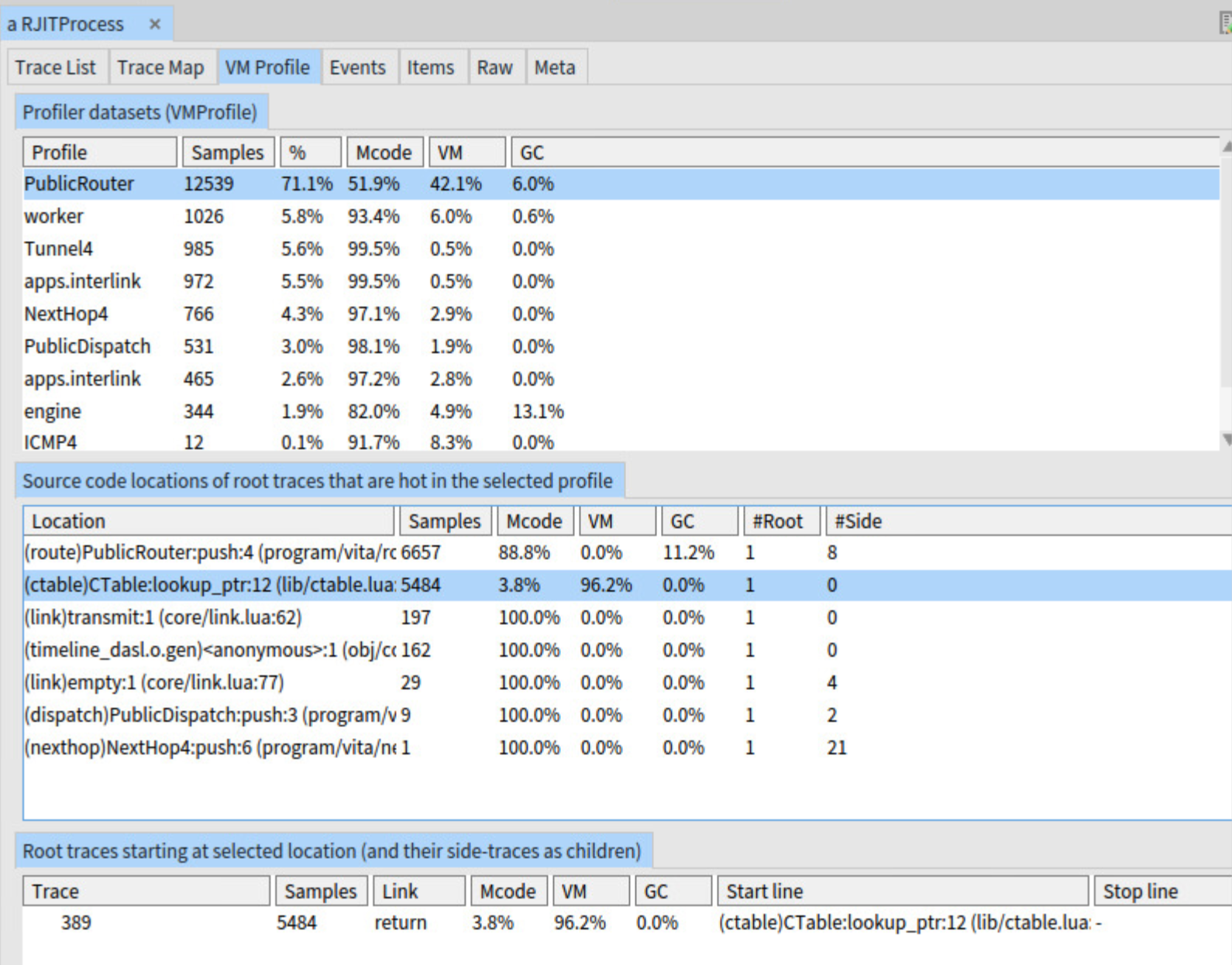
If we load up the offending VMProfile into Studio, it will point out our culprit quite prominently. In this case the problem was a collision in the hash table that maps security parameter indexes (SPI) to SAs, which in turn gave the JIT compiler a hard time. The solution to this issue was simple: there is no reason we need to use a hash table here at all.

However, the wider impact this performance bug had on the dependent processes in this application is less visible in Studio. Visibility into how a stalling process affects the overall network of processes certainly stimulates thought on the division of labour among them. In the end, I think the timeline will prove even more valuable once I start experimenting with different scaling strategies for Vita.